Editing isn’t everyone’s cup of tea, even most writers. However, I love it. Call me funny, but the world takes all kinds, right? My enjoyment of editing is fueled by the same commitment to clarity I utilize for technical writing. With editing, I not only refine textual content but also adjust the visual elements to have more appeal.
This was a callout in a benefits email sent out to employees. While staying true to the brand, the overwhelming use of the color in the original (on the top) was toned down strategically by employing the color as an accent in the edited version (on the bottom). Proving that less color can indeed be more impactful in certain instances.


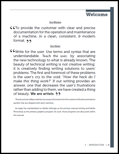
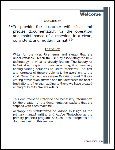
This mission and vision page used a variety text styles sizes in the original version (on the left), causing distractions from the core message. In the edited version (on the right), font styles and sizes were streamlined to minimize distractions. It maintained a purposefully designed appearance, ensuring that the focus remains on the message.


Once more, the excessive use of color can undermine the purpose and urgency of the message. The original version of this recall notice (on the left) was overloaded with elements. In the edited version (on the right), emphasis was placed on the urgency of the notice. This ensures that the message and call to action are presented in a clearer and more readable manner.


